Thought to be a measure of the temperature at which the precipitation was formed.
The diagram in the paper handout shows correlations between the Southern Oscillation Index and 10 natural and historical records. All but 3 show moderate to high correlations. The locations to which they refer are shown in the map, and details of each record follow here. In each case, explain the correlations, or lack of them, between the proxy record and the SOI. Do this in terms of both warm and cold ENSO events, wherever possible. The crucial stage of the explanation will be the connection between the large-scale features of ENSO phenomenon and the regional climate where the proxy was derived. For information, use the lecture handouts, the knowledge of regional climatology you have gained in Katie Hirschboeck's class, and any relevant information you can find on the World Wide Web. A good place to start looking is the El Nińo theme page:
http://www.pmel.noaa.gov/toga-tao/el-nino/impacts.htmlOnce you have worked out explanations for all 10, please e-mail them to me at mhughes@ltrr.arizona.edu, by April 25
Here is some information to supplement the printed handout. The numbers here are the same as those given in section C. Potential proxy records of ENSO, and the filtered data used in the correlation plots and scatter diagrams are the same as those illustrated in the bar charts headed Correlations: seasonal and annual SOI vs. filtered proxy records 1866-1988, although the maximum common period between each pair of series appears in the diagrams here. You can see larger versions of the scatterplots by selecting the small images shown here.
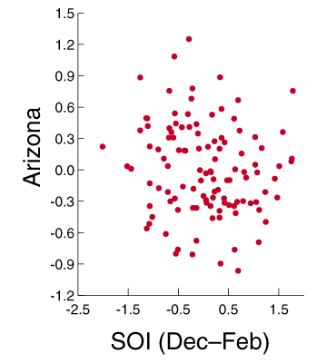
| 1. | Tree-ring index from drought-sensitive trees over a large region of the West centered on Arizona | r=-0.31 for December to February seasonal SOI | |
|
| |||
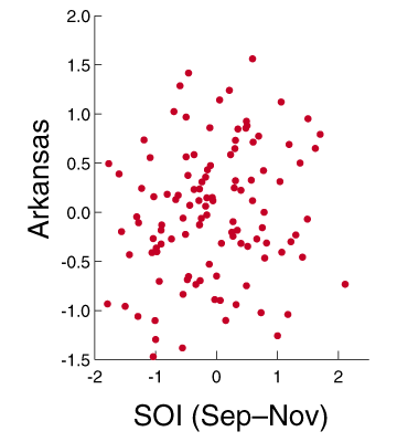
| 2. | As for 1, but for tree rings centered on Arkansas | r=0.17 for September to November seasonal SOI | |
|
| |||
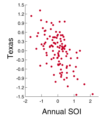
| 3. | As for 1, but for tree rings centered on Texas | r=-0.57 for Annual SOI | |
|
| |||
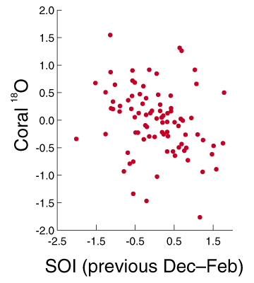
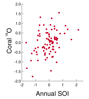
| 4. | Temperature-sensitive oxygen isotope ratios in coral from the Galapagos islands | r=-0.26 for December to February SOI of prior year | r=0.37 for Annual SOI |
|
|
| ||
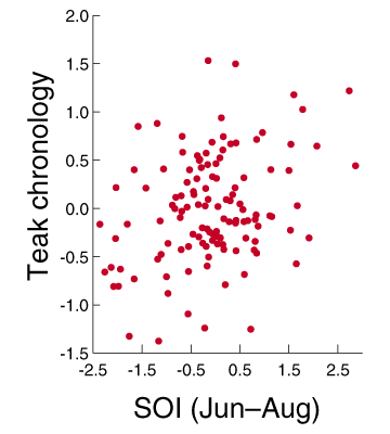
| 5. | Teak tree rings in Java: small rings are formed when the dry season is long. | r=0.31 for June to August seasonal SOI | |
|
| |||
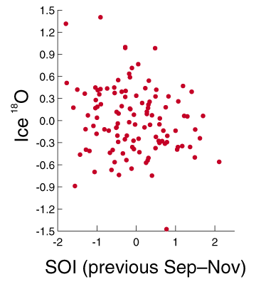
| 6. | The ratio of oxygen isotopes in ice on Quelccaya, Peru (> 6000m elevation).
Thought to be a measure of the temperature at which the precipitation was formed. | r=-0.19 for September to November SOI of prior year | |
|
| |||
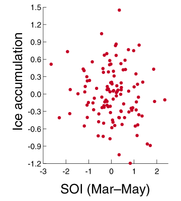
| 7. | Accumulation rate of snow on Quelccaya. | r=-0.12 for March to May seasonal SOI | |
|
| |||
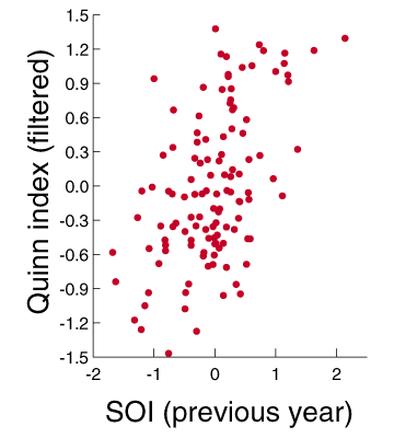
| 8. | An index derived from historical documents recording El Niño events in coastal Peru and southern Ecuador. | r=0.52 for Annual SOI of prior year | |
|
| |||
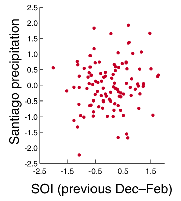
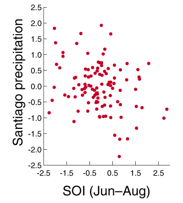
| 9. | Winter precipitation at Santiago de Chile reconstructed from tree rings. | r=0.15 for December to February SOI of prior year | r=-0.26 for June to August seasonal SOI |
|
|
| ||
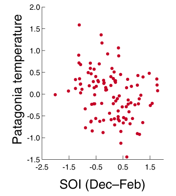
| 10. | Summer temperature in Patagonia reconstructed from tree rings. | r=-0.26 for December to February seasonal SOI | |
|
|